Cheddar Case Study
Creating a seamless checkout flow for desktop food ordering
TL;DR
Summary: More people are ordering food online for pickup/delivery than ever before, however many sites contain significant friction and room for user error. This project aimed to resolve those pain points by building a restaurant site with a seamless, clear checkout flow that puts users’ needs first.
Tools: Sketch, Axure, Google Slides
Deliverables:
Role: Researcher, UX/UI Designer
Methods: Directed storytelling interviews, low-fidelity wireframes, user flow, interactive prototypes, moderated usability testing, think-aloud protocol, findings and recommendations report
“All I wanted was to eat dinner and watch my show when I realized my burrito was delivered to my office downtown” — User B
The Problem
The COVID-19 pandemic changed the way that consumers interact with restaurants. Delivery and takeout options are now ubiquitous, although many digital food ordering tools have not caught up and still present significant friction for users. How can we create a seamless, efficient checkout flow that reduces user error and provides a stress-free experience?
The Solution
Cheddar is a platform designed for adults with busy schedules and disposable income who value efficient, customizable, and reliable options for ordering meals for delivery or pickup when using a web-based service
The Process
Research
To start, secondary research was conducted to become familiar with users' experiences in the digital food ordering space. Competitive services were analyzed to gain a better understanding of their functionality. User reviews of these services were also reviewed in order identify some high-level pain points
After completing a competitive analysis, the focus shifted to primary research which was conducted through directed storytelling interviews to better understand current perceptions, expectation, needs, pain points, and overall experiences in the digital food-ordering space. The goal was to identify opportunities to create a seamless and frictionless food ordering experience for clients. Three participants were interviewed regarding their experiences; the same set of questions were used for each participant and were adjusted slightly to accommodate each participant’s narrative.
Next, research findings were compiled to uncover key user insights. The goal statement for this project was “My user group is adults with busy schedules and disposable income who value efficient, customizable, and reliable options for ordering meals for delivery or pickup when using a web-based service ”
Design
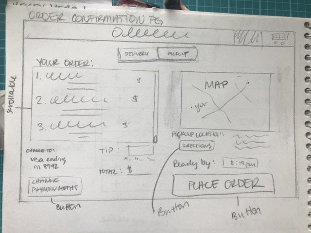
To begin the design process, low-fidelity wireframes were created to provide a framework of what a seamless experience might look like and which features would be the most important based on key features that were identified in the research. Hand-sketched wireframes were digitized and annotated to call out key interactions and clarify what functionality could be tested in future research.
Additionally, user flows were created to outline a full end-to-end map of the site. The overall journey was structured to prioritize an intuitive and easy check-out flow which were goals identified in the research process

Prototype and Testing
UI flows and hand-sketched wireframes evolved into an interactive prototype that was created in Axure and was used to validate the user journey through usability testing. Based on Steve Krug’s think-aloud interview protocol, an interview test script was created to keep consistency when interviewing users.
The prototype was tested with four users by giving them scenarios to (1.) add a food item to their cart and (2.) complete the checkout flow to place an order. They were asked to talk out loud throughout the process, specifically paying attention to any confusion, any surprises, and anything they enjoyed. 100% of users were successfully able to complete both key tasks that were asked of them.
The Results
Overall, users were able to identify the purpose and primary flow of the website. They noted a logical checkout flow that guided them along the intended path of use
100% of users understood the overall concept of the website
100% of users were able to successfully complete the task asked of them
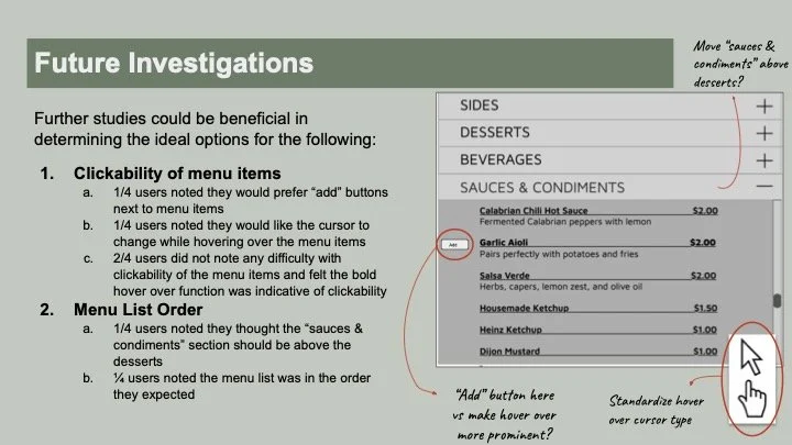
From user testing, 3 action items were identified for areas of improvement in order to improve functionality and user’s understanding of key features:


The Next Steps
In addition to the concrete action items outlined above, usability testing also revealed several areas that should be considered in future research and user testing: